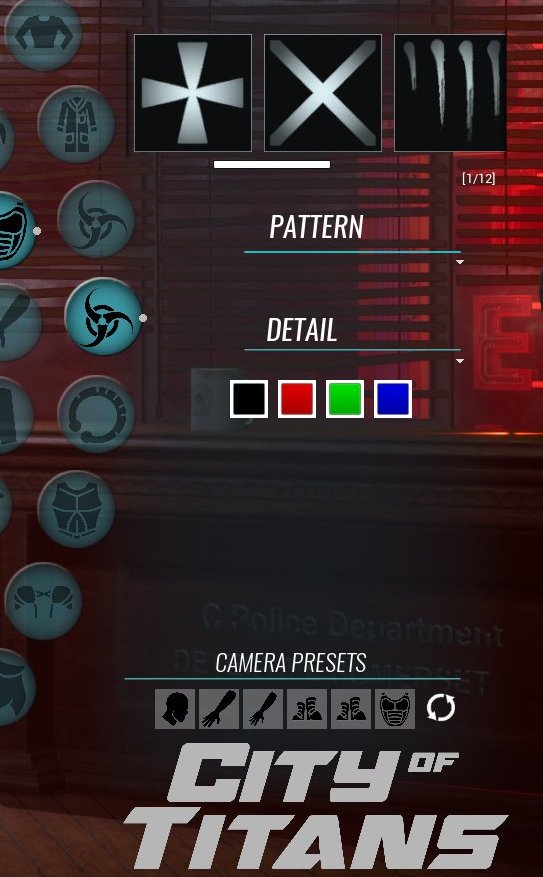
This week we have a one shot showing off a much requested improvement to the Avatar Builder’s UI. Up to now, you’ve been seeing costuming thumbnails laid out horizontally like this:

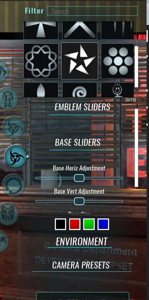
The ‘left to right’ scrolling gets the job done, but it’s slow and gets tedious when there’s a big selection. Since the goal IS to have a big selection, our UI designer Zack ”ShadowElusive” Singer has been trying to improve it . Thanks to his work, the thumbnail window will be getting a new look:

The new design of the thumbnails combines a vertical scroll with a larger, more efficient preview window. The revised layout lets users see more options with each movement of the menu. This change to the UI will be just one of many included in future updates to the Avatar Builder.
Once again, thanks to UI designer Zack "Shadow Elusive" Singer for his work on this.
Visit our webstore at: https://store.missingworldsmedia.com/
Support City of Titans at our Patreon and Read our Comic: https://www.patreon.com/HiJinx
Enjoy our Instagram! https://www.instagram.com/missingworldsmedia/
Why not buy us a Ko-Fi? https://ko-fi.com/Z8Z06NFG
We have a Facebook: https://www.facebook.com/CityOfTitansmmo
And a Twitter: https://twitter.com/CityOfTitansMMO/
Feel free to discuss this update here: https://cityoftitans.com/forum/discuss-one-shot-ui-improvements
OR on our new public Discord! : https://discord.gg/7kVfsju
Wait until you see the... nope, that would ruin the surprise.
