In a previous update, we opened by explaining that a UI has the unique goal of being pleasing to the eye and yet something the player almost completely ignores. Well this actually went double for the Avatar Builder’s UI. While my original experiments were all too vivid, Charles Logan, our former and formidable Art Lead, showed us a better way: a subtle stage on which the character stands uncontested, a king in color in the middle, commanding all attention. The chargen UI has seen many attempts and iterations to get to where it is now, and we expect it has some yet to come. But the goal remains the same: subtle, smooth, and existing to frame and highlight the avatar being built in all its glory.
In the Beginning, There Was Color. A Lot.
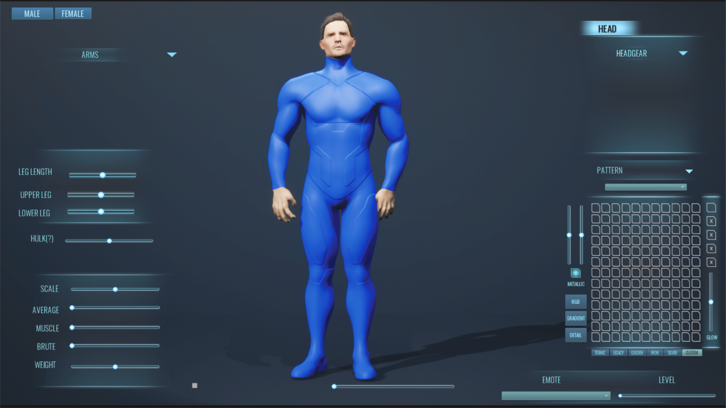
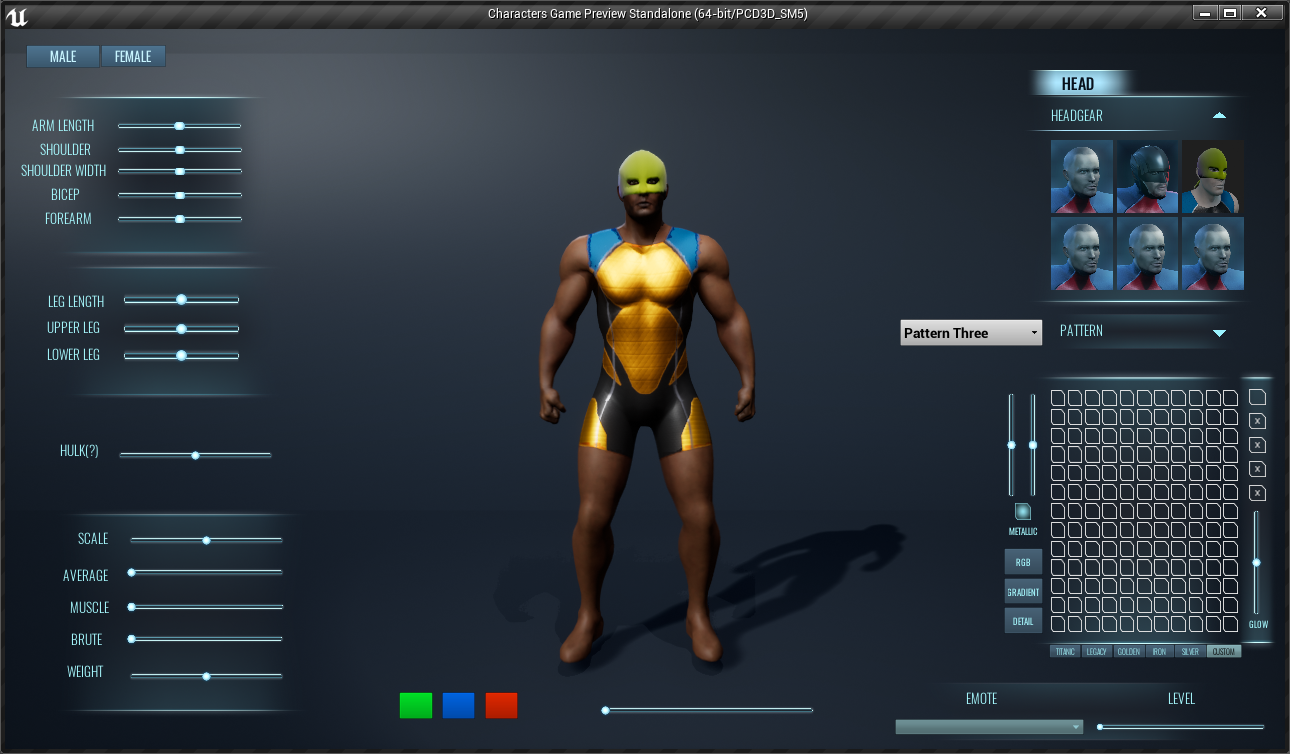
The more minimal graphics of my early gameplay graphics did not, unfortunately, carry over to my first avatar builder experiments, although lessons learned working on the Nimbus about always maintaining scale and setting while working on pieces did. I think I was thinking of the colors of our predecessor. Either way, here it is, in all its all too technicolor glory.
Other than color, the way elements are oversized, and general space eating, it’s actually not so terrible. The inherent ideas about organizing the information and presenting things in a consistent manner aren’t bad, and placement is good. That said, this is definitely that early stage all creative people tend to be a bit embarrassed to talk about. I had it in me, but I had a lot to learn. But that curve to the options on the left was an idea that stuck and, eventually, made itself seen again.
Still, it was early experiments, and I did experiment quite a lot. I got my technique for prototyping down pat, and for preserving various stages sanely in a single document. I was ready for the next stage by the time Charles came along.
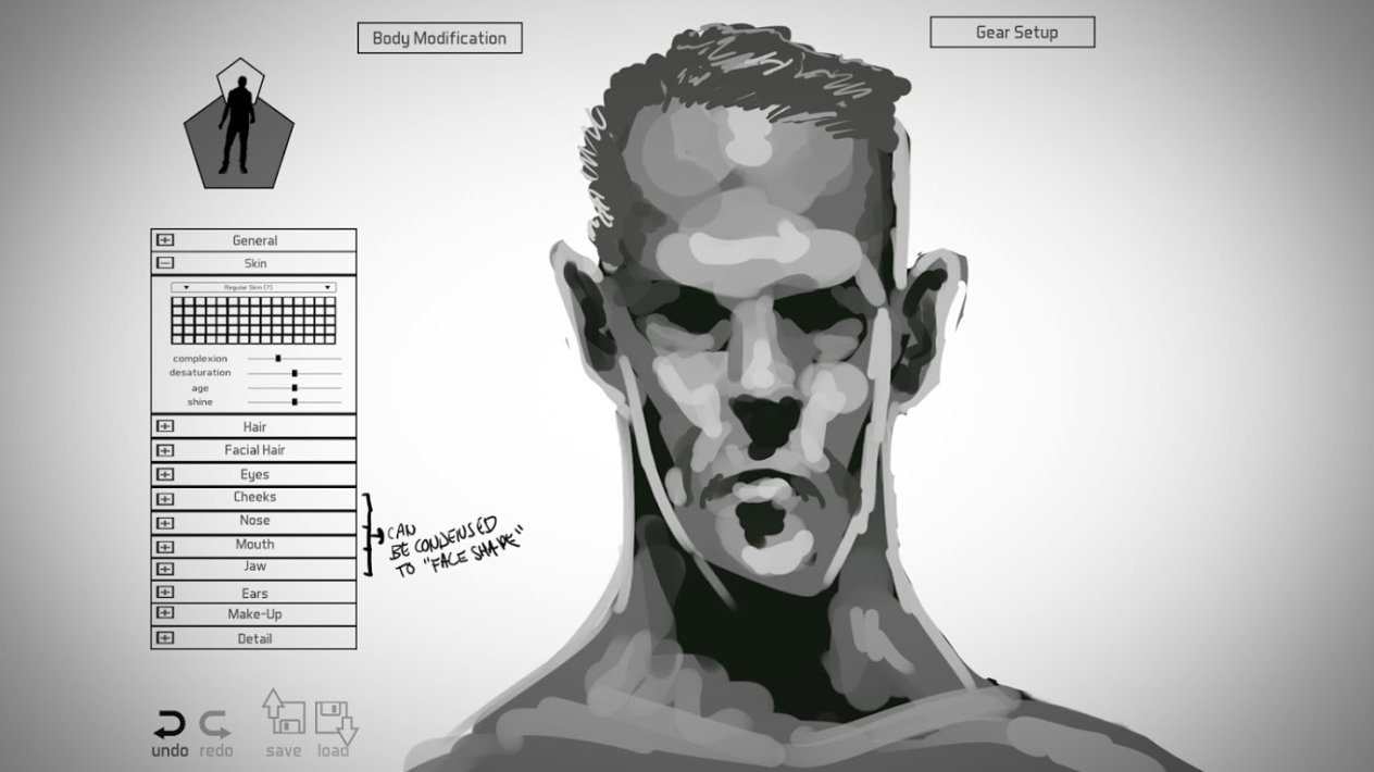
Chargen was the focus when Charles Logan entered the stage, and remained so for some time. Note the hand drawn mockup. I couldn’t do that to save my life, he spat them out in like ten minutes. At some point, we had an actual in-game prototype going, and Charles - because he could do everything - was involved in implementation. While no one denied it was just prototyping, it still indicated the direction we were headed aesthetically.
Meanwhile, I was still involved. There was a longer term goal to figure out, and I was in Illustrator bouncing various design proposals off Charles, or trying to help figure out how we were going to organize the massive information dumps our highly customizable approach would present. I’d paid attention to what Charles had done, grabbed new screenshots for background context and adjusted to match the style Charles was adopting, with the result that the mockups I produced then are far less embarrassing to me now.
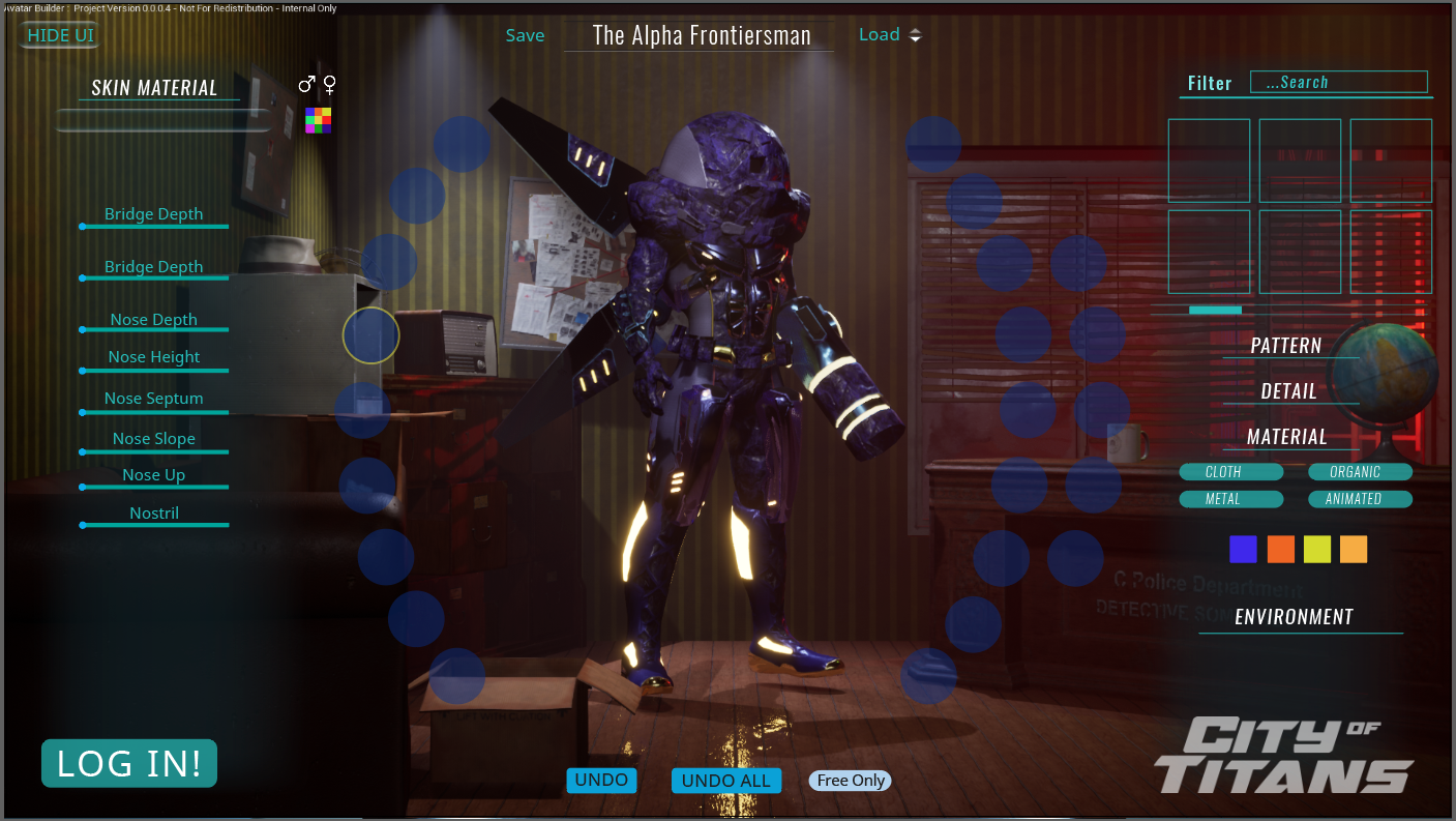
Eventually, the in-game prototype looked like this.
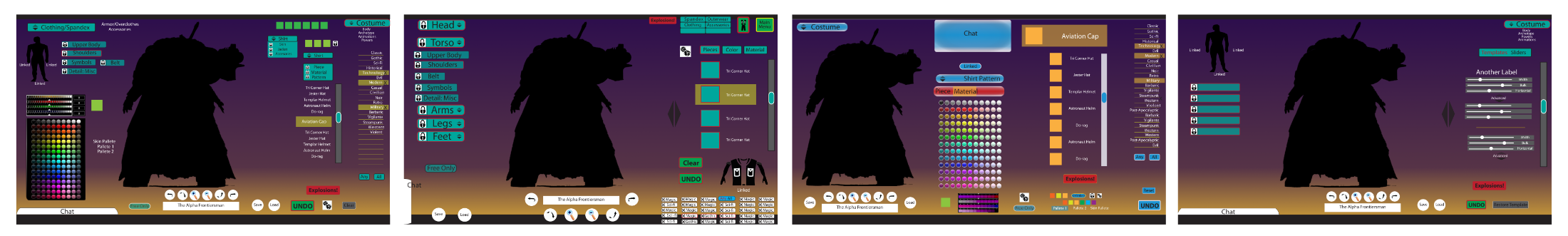
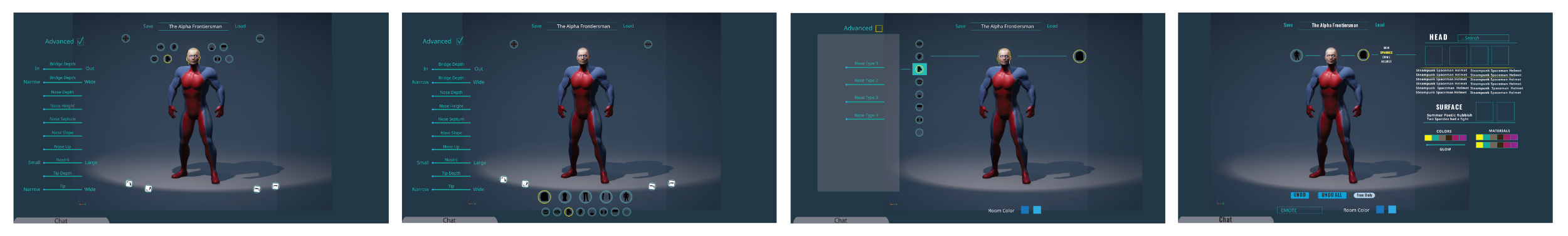
But by now, there was also an established ‘end goal’ UI. We knew what we wanted to end with. So the next time the Avatar Builder was rebuilt, the UI, while still prototype, was setting the stage for it. At some point, the Avatar Builder looked like this.
Whatever it might look like at first glance, it was a good start. The menus were all in place and in the right places, and more or less organized as intended. The radial menus were implemented, just very rough. It was ready for one more push. But Geeks (Jamie ‘Geeksgonebad’ Cunningham) was trying to stand in for too much, and graphics and UI was never supposed to be his wheelhouse. And Charles was gone - his other project, the one he’d been a part of since college, had funding, and he couldn’t do both anymore. At first, I stepped in the way I knew best - refining design in illustrator, only now I had to provide graphics we could work with. I wasn’t Charles, but I knew my limits and how to work with them, and those limits had expanded a bit over the years.
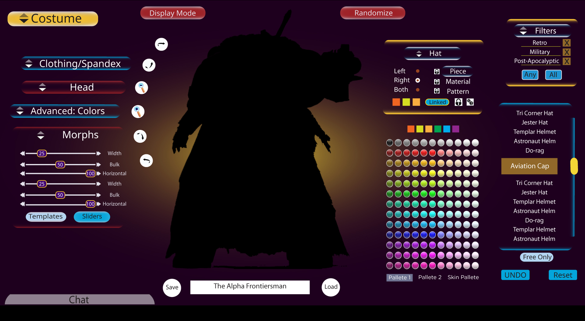
At first, I was defaulting to handing everything to someone else to implement. But Geeks was just too overwhelmed to spend much time on it, and it was finally becoming clear to me that trying to remotely guide someone else to make these kinds of adjustments was a good way to triple the time and frustration of completing a task. In the end, it would actually be easier to learn to do it myself. Which reminded me that I’d always intended to learn the systems, but someone who knew it better had always been there and it had always seemed more efficient to let them handle it. So, at last, I dived into UMG - Unreal Engine’s User Interface system. Swapping graphics was easy. Other parts were harder. I spent a lot of time growling at the limited control over combo boxes. I had to adjust the design here and there to work with what I could actually do. But in the end - and with a little help from Geeks - it looked like this: the Avatar Builder you’ve come to know and lust for from our last two videos.
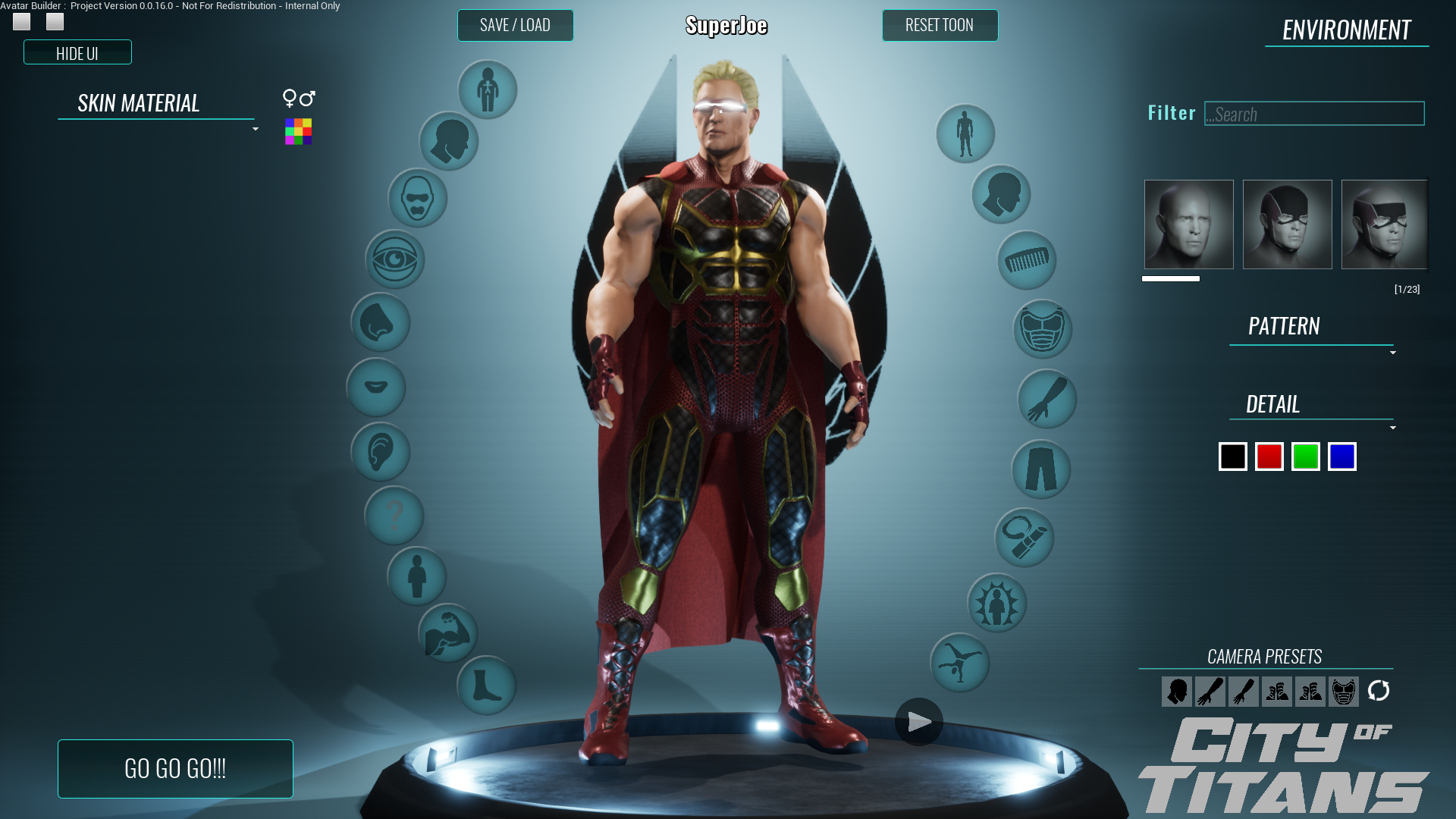
Like any perfectionist, I’m not completely satisfied yet. I’d love to see those radial buttons default to something mostly transparent, becoming opaque on mouseover. I’d love to improve that thumbnail viewer. And of course, the color selector needs work. But it has become something we can show to the public and say ‘oh it’s not perfect, but it will get better. And in the meantime, have fun!’ Now the challenge lies elsewhere, in the infrastructure to support distribution.
Written by: Zack ‘ShadowElusive’ Singer
For more of Charles Logan's art visit: http://www.cloganart.com
Support City of Titans at our Patreon and Read our Comic: https://www.patreon.com/HiJinx
Enjoy our Instagram! https://www.instagram.com/missingworldsmedia/
Why not buy us a Ko-Fi? https://ko-fi.com/Z8Z06NFG
We have a Facebook: https://www.facebook.com/CityOfTitansmmo
And a Twitter: https://twitter.com/CityOfTitansMMO/
Comment on this update: https://cityoftitans.com/forum/discuss-design-evolution-ui-avatar-builder