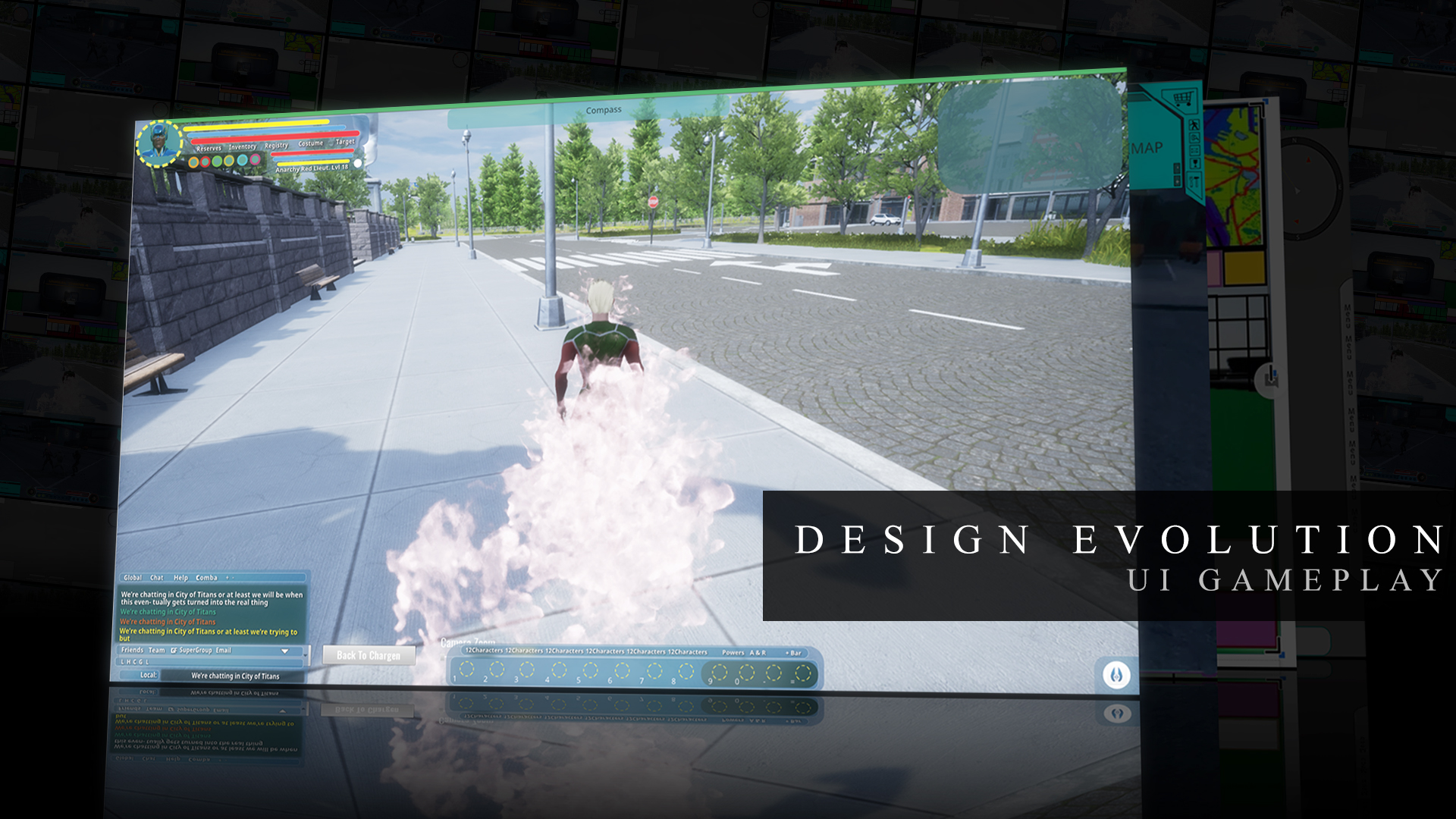
A game’s graphics are meant to appeal. A game’s mechanics are meant to make you feel amazing or challenged. A game’s sound effects are supposed to add life. But a good game’s UI is meant to disappear. Of course you’re supposed to like it when you look at it, but it’s not the point and it’s not supposed to hold your attention on its own. The UI is the interface through which you interact with the game, and the less impression the existence of that intervening barrier makes, the better. A good UI disappears into the overall experience of the game. Which makes it a bit unique when most of the game is, well, loud.
Our predecessor in the superhero MMO genre set a high bar for UI. Minimal, graceful, with menus sprinked wherever they made the most sense instead of in single menu-dedicated clumps. It’s been a lot to live up to, and the evolution of the UI towards that point has gone in unexpected directions at times and changed hands several times as well. But just like in everything else, it’s been City of Titans' ambition to meet and surpass the old standards in our own ways; recognizable in inspiration yet in no way derivative. You’ll be seeing the journey pretty much from the beginning to the end, albeit with some of the segues cut out for sake of brevity and clarity, and we hope you’ll have some useful responses for us to guide what will come next.
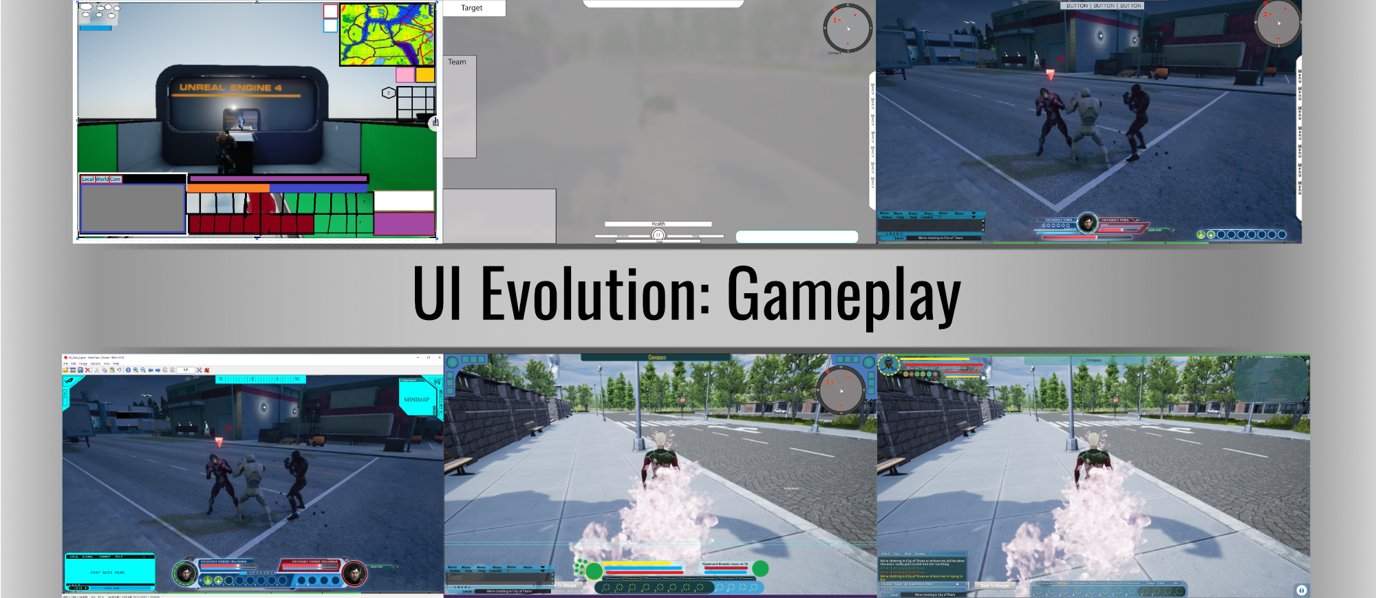
UI Evolution: The Gameplay
The first to begin, the last to finish. When I first entered the UI team several years ago, there hadn’t been anyone moving it forward for some time. Concept consisted solely of a unique contribution of our Project Lead known as Bad Drawings.
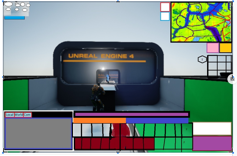
No prizes for guessing why. Warcabbit dubbed them himself and understands what they are. He saw them as something to get people started. I, not yet familiar with that practice of his, saw them with some degree of horror. The concepts, stripped of the graphics, were still intended to kinda fill the screen up, placing things where they would be closest for looking at but also kinda in the way. I looked back at our predecessor, looked over some other game UI, and came back and explained as follows: UI can either follow the philosophy of utility, moving in and being where most convenient, or the philosophy of staying back and leaving the game clear and open to be immersed in. We were going to follow the second. That was when I made my first ever 2D dimensional mockup, using a screenshot from paragon chat and simple geometry in Illustrator to show what sort of idea I was thinking of. The version presented here is not using that background, for obvious reasons.
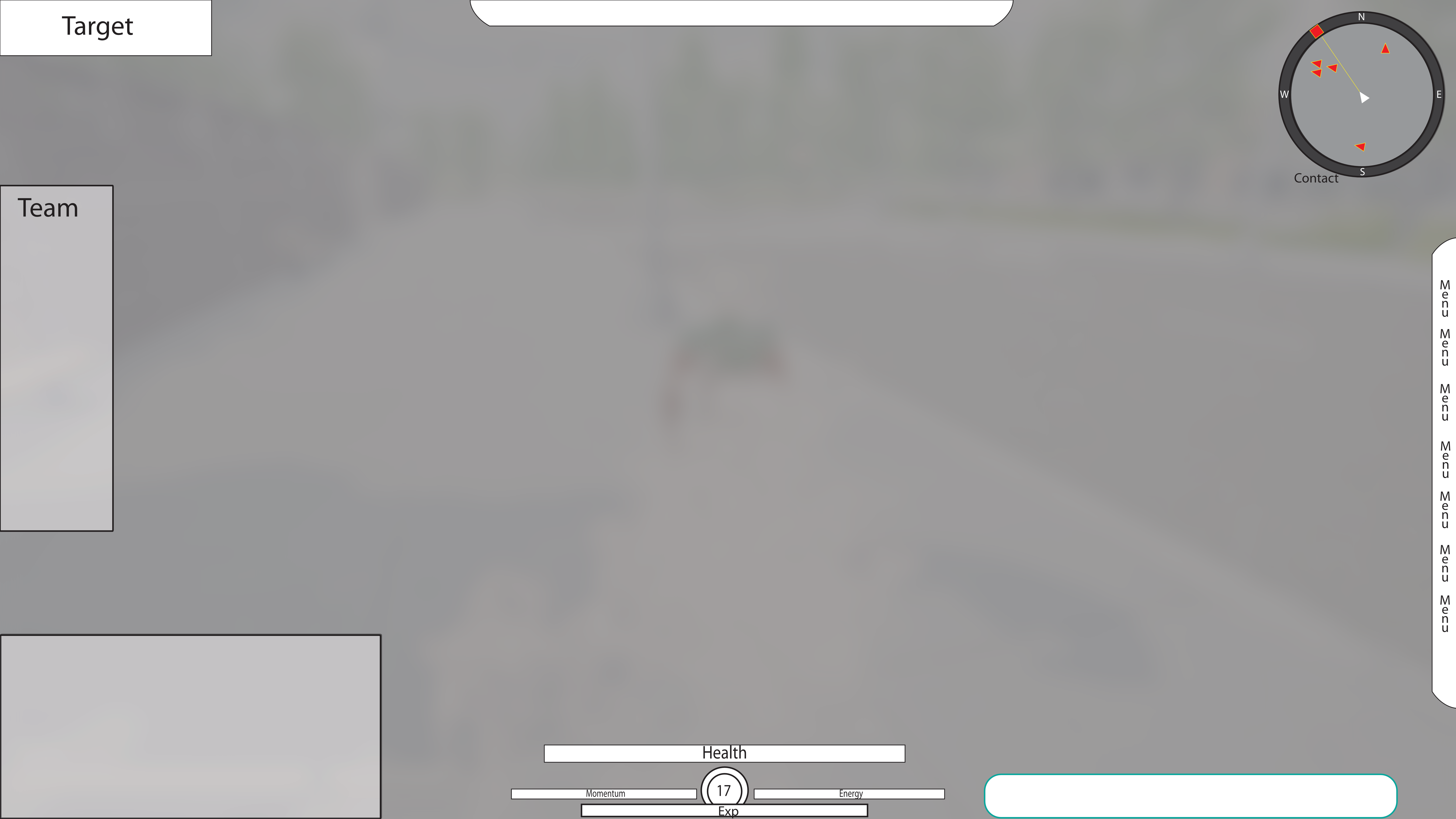
After that, there were some experiments. One thing that turned out to be true no matter how much I learned was that you churn out a lot of what I call ‘raw geometry mockups’ trying to find what you want. These were early days, and appropriately, little was taken for granted. I was really trying to push how the player array would work.

A Wild Charles Appears (it has joined your team!)
About two and a half years ago, we were blessed with the help of Charles Logan, originally and still the Art Director for ROTU ( https://rotu.com ). He offered as a texture artist and was the Art Lead about a month later. He could do more faster and better than I’d have thought possible, he could work with anyone, and he knew what we needed. He was a rockstar, and the two years we had him were lucky ones. And of course, he had a big impact on UI.
At the time, I’d been trying to work out the Chargen, the eye smartingly saturated results of which you’ll see in the update to come on the evolution of the chargen UI. But of course at some point it became time to return to the gameplay UI. Before, I’d been working in a vacuum of sorts, but Charles had brought a clear aesthetic theme to the art department, and that extended to the UI. He was also a far better graphics man with real UI experience, and overall, I was the padawan to his Jedi Master, helping with mocks to work out design approach while he made things that looked good almost as fast as I could assemble circles and squares. While I had my influence in many ways, this was my apprenticeship, and a valuable one it was. By the time Charles had to leave, the mockups looked like this.
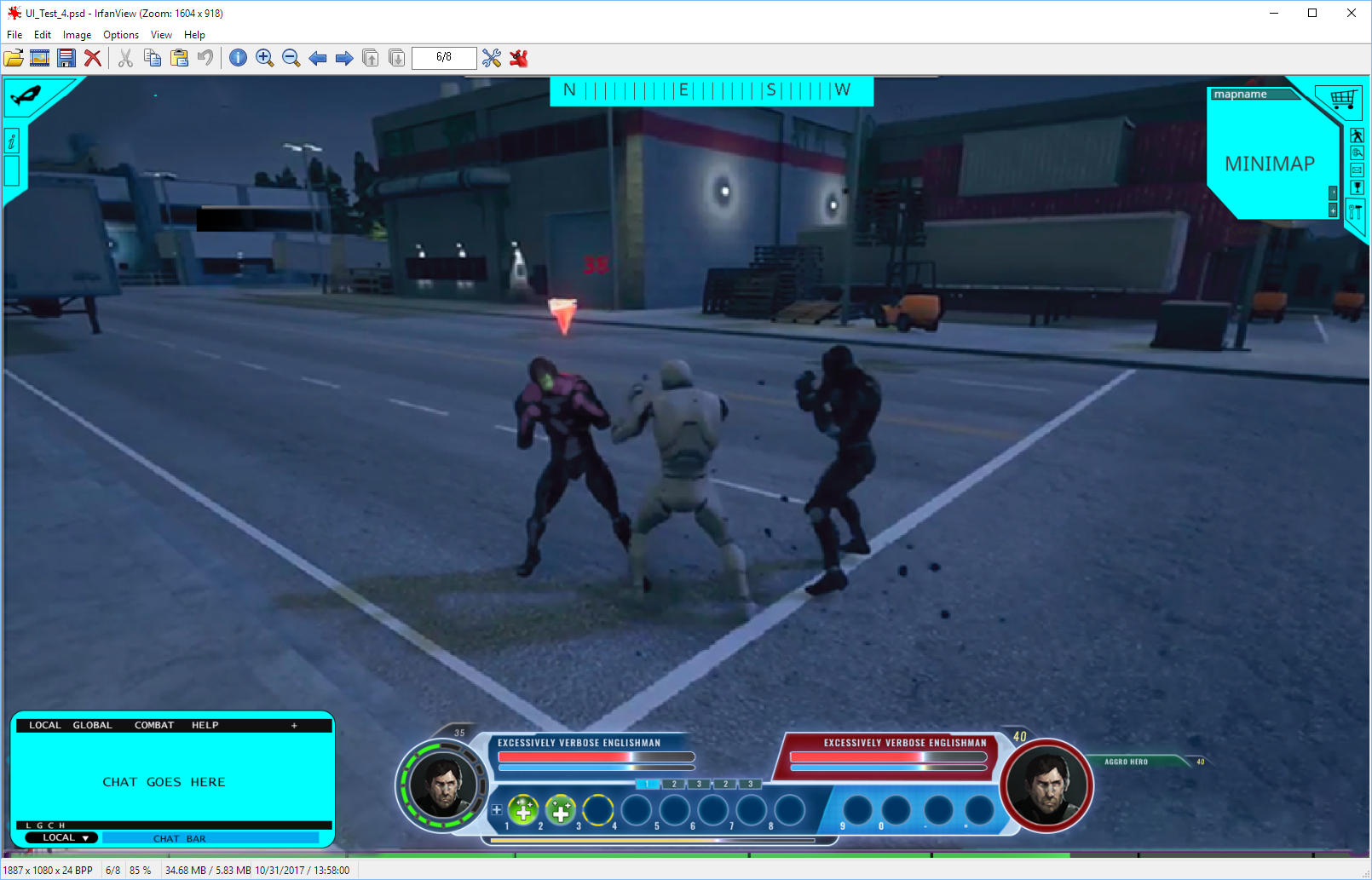
Graphics wise, obviously an improvement. But there were a few caveats. None of them were considered finished concepts, it had very much been still in progress. You can clearly see at least two distinct aesthetic approaches that hadn’t yet been resolved. The angled buttons were a thing we weren’t sure we could actually do in engine, the player array/power tray setup was frankly too bulky, the overall aesthetic hadn’t seen much iteration or argument yet, and, last but not least, we didn’t have the actual art for them. All of it needed work, and Charles was no longer with us. But I’d grown a lot under him. I’d learned subtlety, to spot when good graphics flow did not equal good UI flow, and to bloody shrink things down. But while we’d agreed on the fundamentals, we didn’t on personal preferences, and with him gone, it was going to be on me for the foreseeable future. What’s more, I couldn’t really produce something like the player array style graphics. I chose to revise in a different direction.
The Third Stage
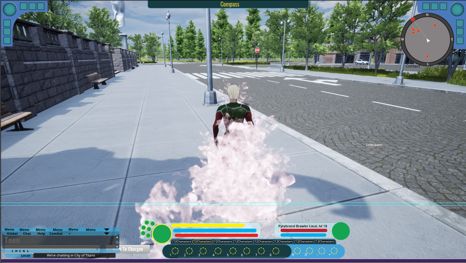
At first, I wasn’t really departing from the original by much. I experimented with a version of the corner menus with more standard button shapes, made the compass a bit more subtle, continued with the chat design I’d submitted to Charles, and roughly continued the player array style, except trying to keep the three elements of tray, player and target separate so they could be moved independently by the player if desired.
At some point, Wolfgang, a graphic design volunteer, was brought in to help. With his input, the style got a big boost in evolution and really settled into something sophisticated. But there was still something bothering me about it, and when I looked at our predecessor again, it was clear what: it was still too clunky somehow. I liked the functionality of having the player data, tray and target in one place and had pushed for it for years, but I finally realized it was also what bothered me, because piling it all in one place was just too loud and intrusive. When I gave shaking up arrangement to get the compromise I wanted one more try, I got this.
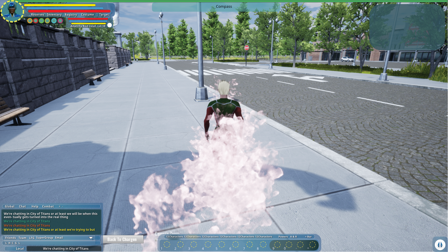
It met general approval. Charles found the time to say that it did a great job blending old and new - the Jedi Master gave my trials a passing grade, apparently. It’s not set in stone yet, but it finally feels like a worthy succession. And of course, we welcome your input on that, now and going forward.
Written by: Zack ‘ShadowElusive’ Singer
Support City of Titans at our Patreon and Read our Comic: https://www.patreon.com/HiJinx
Enjoy our Instagram! https://www.instagram.com/missingworldsmedia/
Why not buy us a Ko-Fi? https://ko-fi.com/Z8Z06NFG
We have a Facebook: https://www.facebook.com/CityOfTitansmmo
And a Twitter: https://twitter.com/CityOfTitansMMO/
Comment on this update: https://cityoftitans.com/forum/discuss-design-evolution-ui-gameplay
